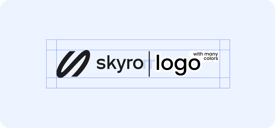
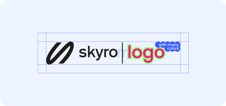
Logo
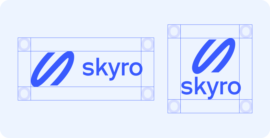
The main logo is used primarily. The vertical version is used only on extremely narrow media
Download

Security field
The logo's security field is constructed from the width of the letter O. This rule applies to all versions of logos
Color
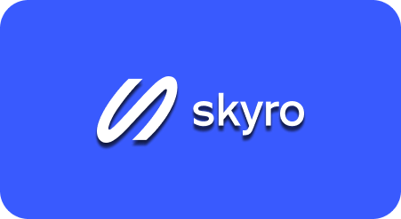
The logo comes in three colors: blue, white, and black. Blue is used on light backgrounds, white on dark backgrounds. Black is used in exceptional cases where the blue logo lacks contrast
It is important that the contrast between the logo and the background is at least 4


Minimum size
- For the main version: 4 mm, 14 px
- For the vertical version: 6 mm, 16 px


Don’ts


Icon
Usage
The icon is used in the app as an avatar on social media
Download

Construction
The icon should look good with any rounded corners. The icon's security field is built according to the line thickness in the sign

Color
In most cases, a primary icon with a blue background is used. If the layout background is blue, there is an additional option with a white icon background


Co-branding
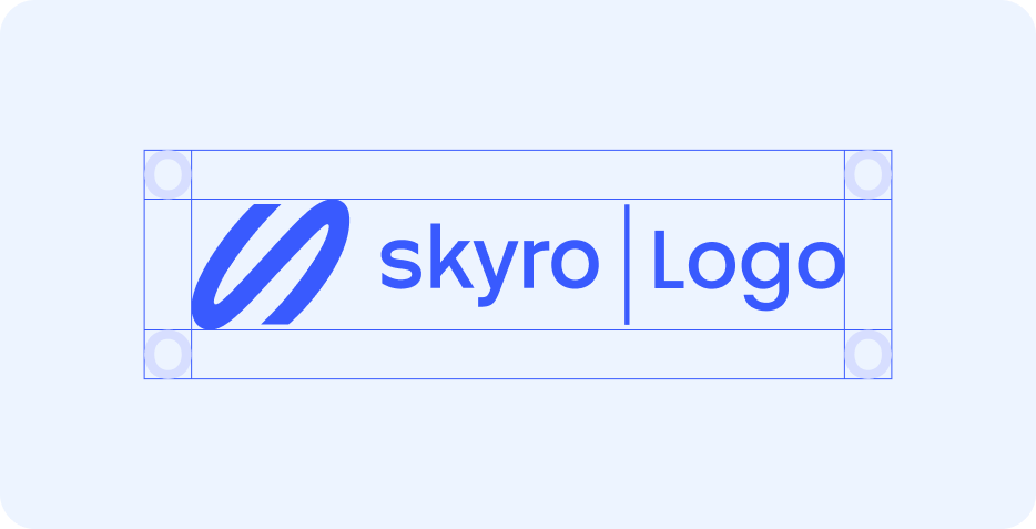
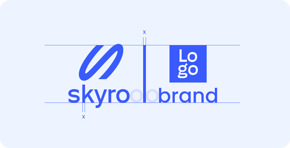
Co-branding is necessary when we collaborate with other brands. It's important to separate logos so they don't look like a single brand
Horisontal version
The security field of co-branded logos is equal to the width of the letter o from the logo
Сonstruction
-
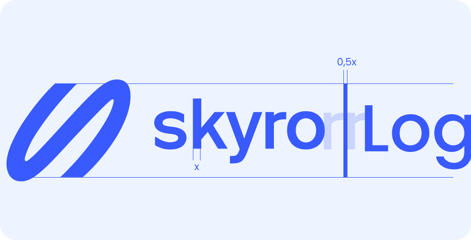
The thickness of the divider is half the thickness of the vertical stem
-
The distance from the logo to the divider is the width of the letter r from logo
Vertical version
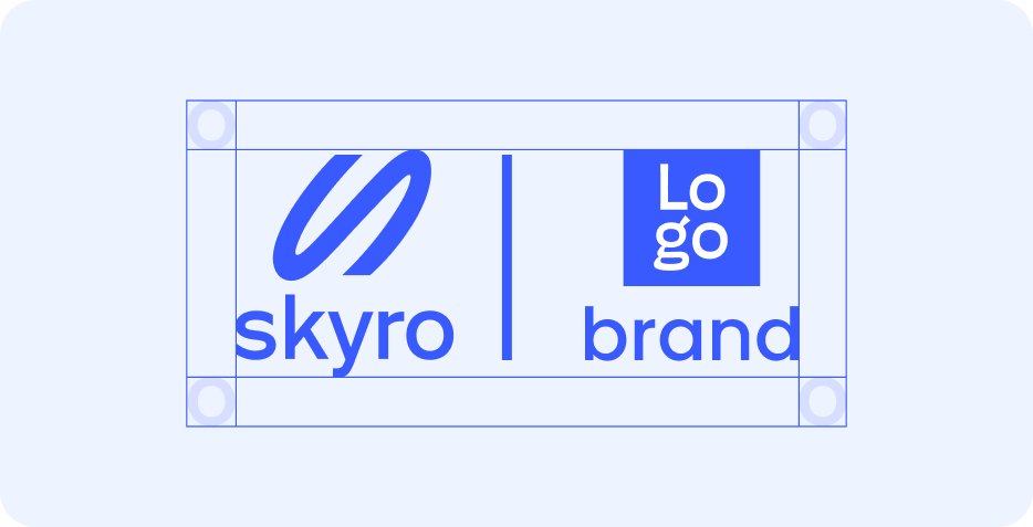
The vertical version is used in narrow media and in cases where the partner does not have a horizontal logo
The security field of co-branded logos is equal to the width of the letter o from the logo
Сonstruction
-
The thickness of the divider is the thickness of the vertical stem
-
The distance from the logo to the divider is the width of the letter o from logo
-
The divider is aligned with the guide of the lowercase letters of the logo and with the cut of the vital line from the logo
Exceptions
For situations where a partner cannot repaint the logo in our corporate color or the logo is very complex and does not involve using the same tone, there is an exception rule. In this case, co-branding is placed monochrome in black and white tones.