Iconographics
The icon style is formed linearly based on the principle of the same container for all icons. The geometry of the icons rhymes with the plasticity of the logo construction. Iconography uses the same rounded edges and elements with a beveled edge
Download

Background
Icons can be used on dark and light backgrounds
Construction
Container
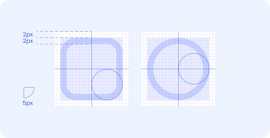
Icons are usually built from two shapes: a square and a circle. The margins from the edge and the width of the line are 2px. The rounded corners of the container are 5px
Graphic features
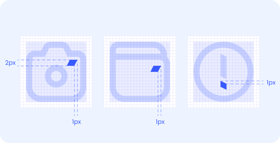
A distinctive feature of the iconographic style is the characteristic bevel of the line endings. The principle repeats the geometry of the logo. The bevel depth is 1 px, thickness is 2 px
-
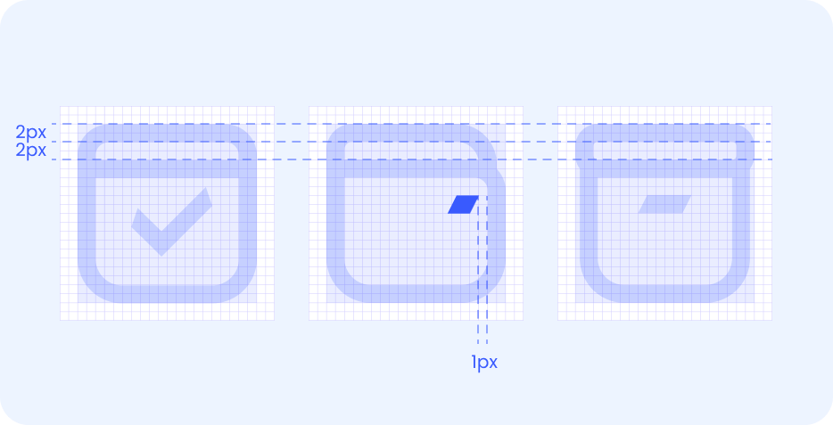
For closed contours inside the container, the distance between the lines must be equal to the thickness of the line itself and be at least 2 px
-
The margins to the objects inside the container should be at least 1 px
-
Small parts are also 2 px thick.
Color
Icons can be painted in any corporate palette colors, depending on the context, media, and environment of use. It is important to maintain visual integrity and readability at the same time. The interface uses only the system icon. The use of local colors is acceptable in marketing communications


Don’ts